


9 MONTHS PROJECT / FULL REMOTE
Client: Public Administration
Project: Digital product creation
We were asked to design the new user experience (Web Responsive and App) focused on tracing and verifying the authenticity of certified Italian agri-food products and wines.
OUTCOMES
— MLP Concept TrustYourFood with 50+ screens for 20 features
— Detail Design Web TrustItaly with 100+ screens
— Detail Design App TrustItaly with 100+ screens
MY ROLE
During both streams (web and app), I was involved in the whole process, driving the UX design and being the main interlocutor with the client:
— I was in charge of understanding the current as-is experience in the market (only on app) and translate it to web
— Supported the team in looking for best practices and benchmark examples that could inspire the design of certain features
— During design sprints, I was responsible for designing wireframes, flows, defining ux behaviours and guiding the team in delivering prototypes the client
1.PROOF OF CONCEPT
TrustYourFood Concept, a new digital experience that lets you verify products in Italy.
The primary aim was to enhance the physical product label by creating a digital passport; providing easy information access, and delivering added value to end consumers, certifiers, and vendors.
We designed the POC MVP (only for Food) following 3 specific use cases given by the client.
It aimed to bring benefits to both the consumers but also the certifiers, producers and vendors.
The design has been done after having understood the main functionalities and the as-is experience of both of the current existing apps (food and wine) and translating it to a web responsive solution.

Proof of Concept WEB RESPONSIVE | Trust Your Food
For consumers
Improve the User Experience of checking a physical product
Introduce security elements for online purchases
Offer more content on products (e.g. Nutritional Information) and encourage a sense of belonging to a community that espouses values of quality and uniqueness
Certifiers, Producers and Vendors
Provide new ways of interacting to get closer to consumers (e.g. reports on counterfeit products)
Retrieve information on product movements
Greater visibility and recognisability in the physical and online world
Clear distinctiveness of products thanks to physical and digital guarantees and the promotion of quality
2.WEB DETAIL DESIGN
Desktop and Mobile
[ 5 MONTHS ]
Creative Concept & Logo Creation

The communication team developed a creative concept that guided the construction of the brand identity of this Traceability Project.
Nurturing Quality
Through an elegant and minimal graphic treatment, we closely observe Made in Italy products with a scientific approach: we delve into the details of their composition, explore their history and origins, also through photographic shots that narrate the territory.
Trust Italy Logo


Validating the concept through user tests
We initiated the testing phase for the concept by conducting remote user tests.
The main goals of the user tests
• Validate and gather feedback from TrustYourFood concept
• Understand the purchasing habits of people
• Gather needs and wishes to incorporate into the concept
Our study involved 12 participants spanning diverse age groups and geographical locations across Italy. The recruitment criteria were tailored to include considerations such as age, residency area, familiarity with certifications, experience with digital apps like Yuka or Vivino, and categorization into consumer, restaurateur, or distributor segments.
This approach ensured a diverse and representative sample, providing valuable insights into the user experience from various perspectives.


We gathered insights, needs, and desires from the participants, compiling them into a User Test Report. This report was presented to the client and served as the foundational reference for the Web design efforts.

Operative workshop - Prioritization of functionalities (together with the client)


Definition of the navigation model for web responsive
We defined the navigation model for this web-responsive digital solution focusing on an optimal user experience.
My approach to crafting navigation models involves a deep understanding of user behavior, information architecture, and the overall goals of the digital product. Through analysis, and user insights from the user tests, we identified the most effective ways to organize information and streamline the user's path to their desired destination.

UX/UI Design Sprints
In each sprint, our focus was on specific features and flows. We designed and iterated based on weekly client feedback in collaborative checkpoints. Our tasks included working on wireframes, defining interaction behaviors, working on user flows, crafting UI, establishing layouts, and building prototypes for client presentations.
In parallel, we collaborated on the copy, working alongside a UX writer who provided valuable support. This collaborative effort allowed us to refine and optimize the written content, ensuring it aligns seamlessly with the overall user experience and design objectives.
My role: My responsibility involved designing wireframes and shaping all UX behaviors to ensure the utmost simplicity in this new digital experience. I collaborated closely with the UI designer, fostering communication and sharing ideas to create a comprehensive and well-thought-out solution.

Example only for mobile web

Crafting digital experiences: Designing flows and prototypes for desktop and mobile
We designed a web solution that encorporates both Food and Wines, on desktop and mobile.

Design system / UI Library
Creating a design system was a pivotal step, and creating it early on was crucial for our project's success. It ensured a consistent and coherent user interface, delivering a seamless and intuitive experience. The design system also facilitated collaboration among team members, providing a shared language and framework, streamlining communication, and making the design process more efficient and cohesive.
As we transitioned into the second phase of the project – the design of the app – the design system proved to be instrumental, as we could leverage predefined components and styles, ensuring a uniform look and feel throughout the application.

3.APP DETAIL DESIGN
[ 3 MONTHS ]
Sprint planning
The initial phase in approaching the app design - involved identifying the features/flows to be designed, analyzing which ones required design attention and needed to be prioritized and then structuring them into 3 main sprints.

Definition of the navigation model for the App

Design Sprints
Gathering some best practices
In every sprint and for each feature that had to be designed, my responsibility was to research existing market solutions and identify best practices to inspire our design approach.

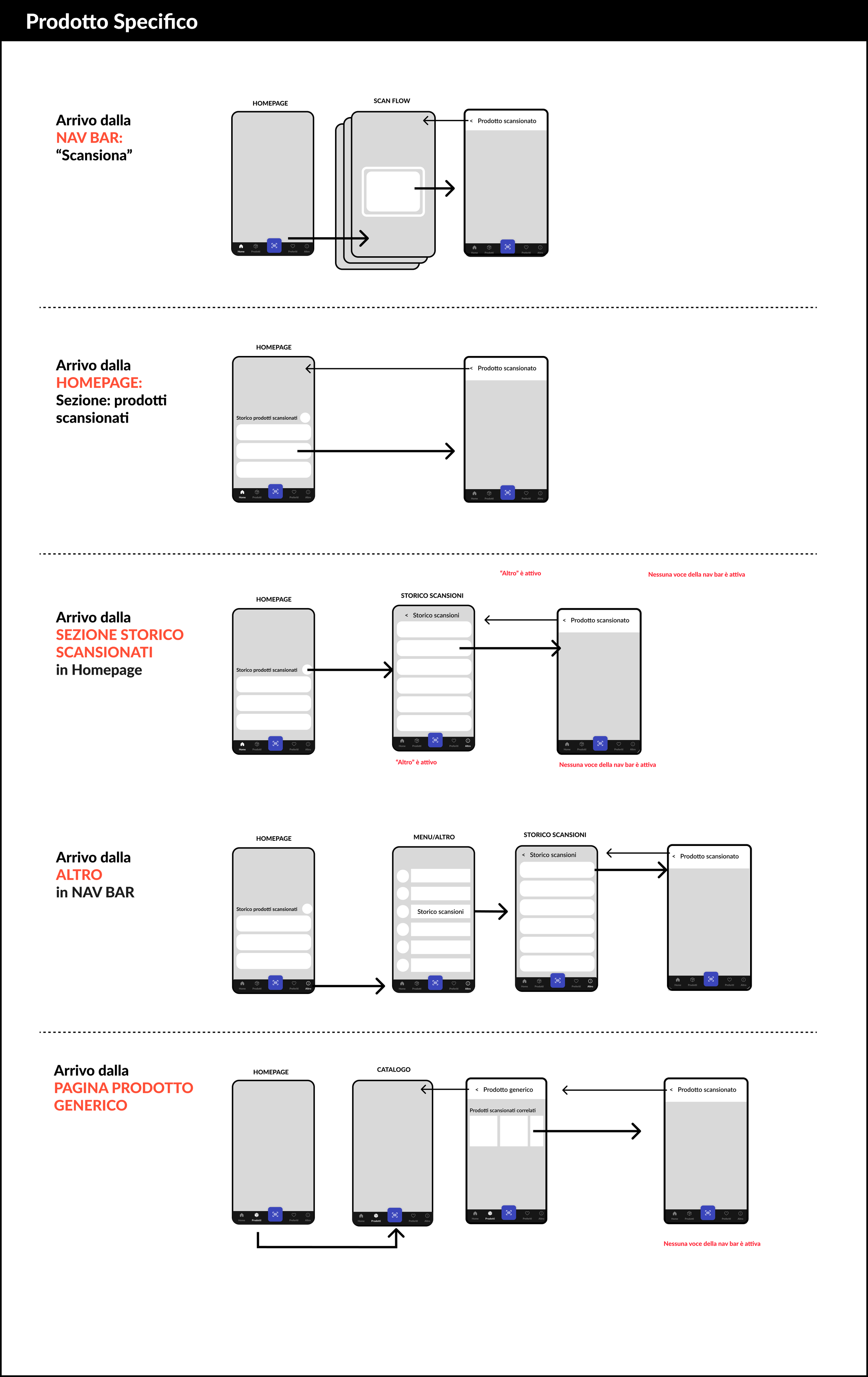
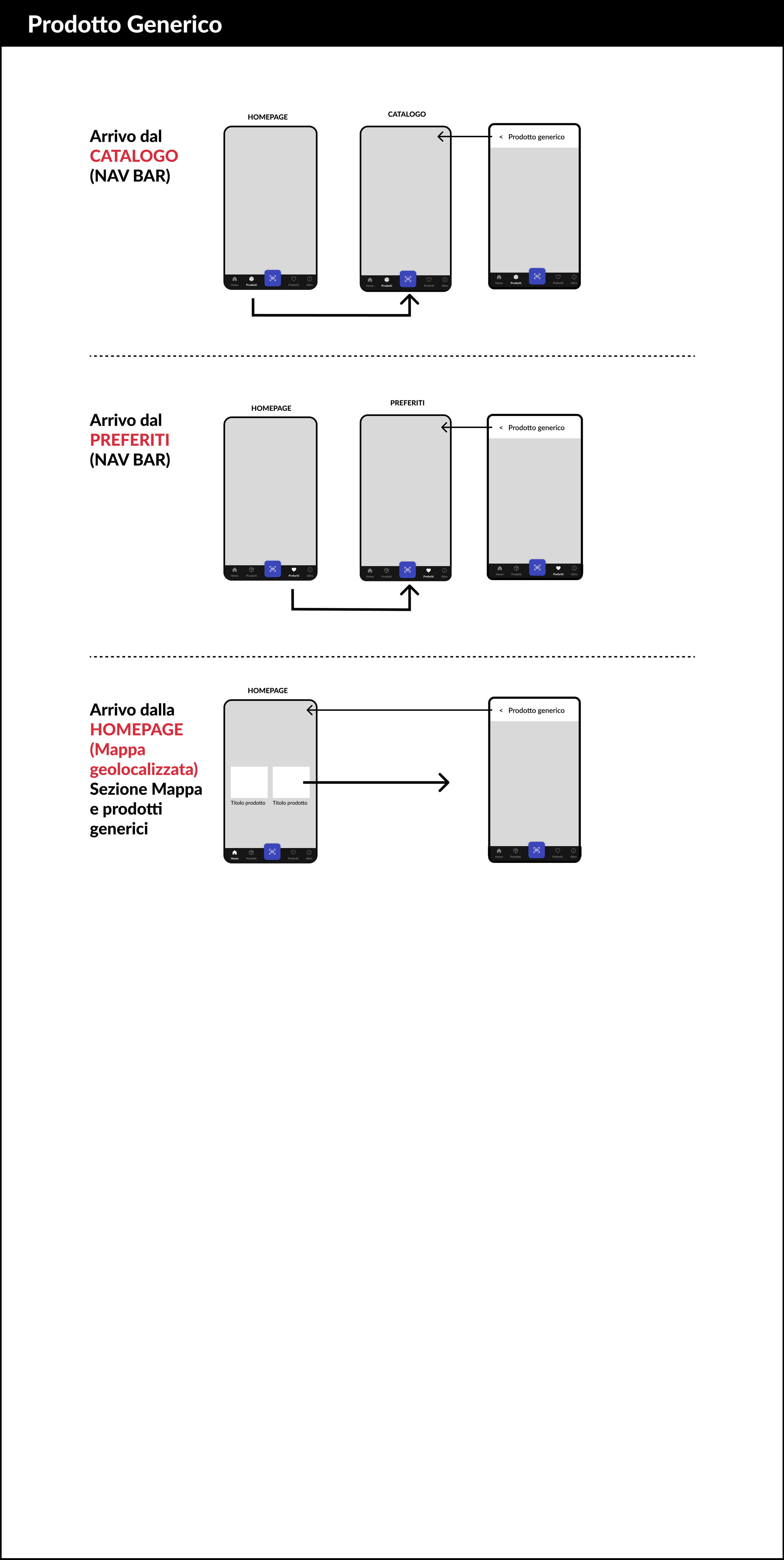
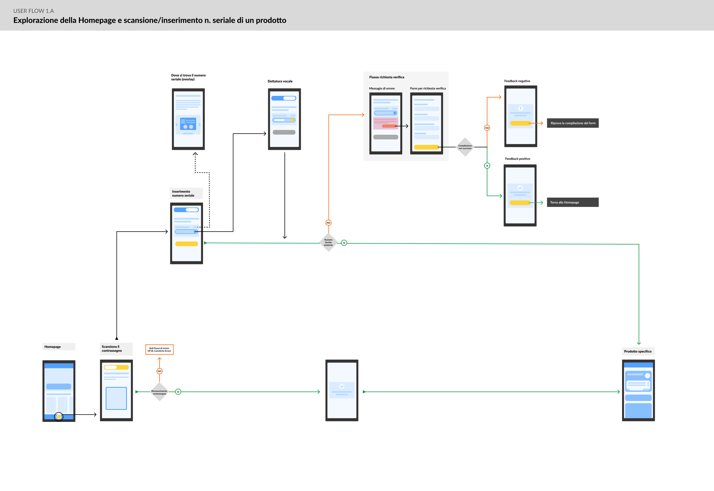
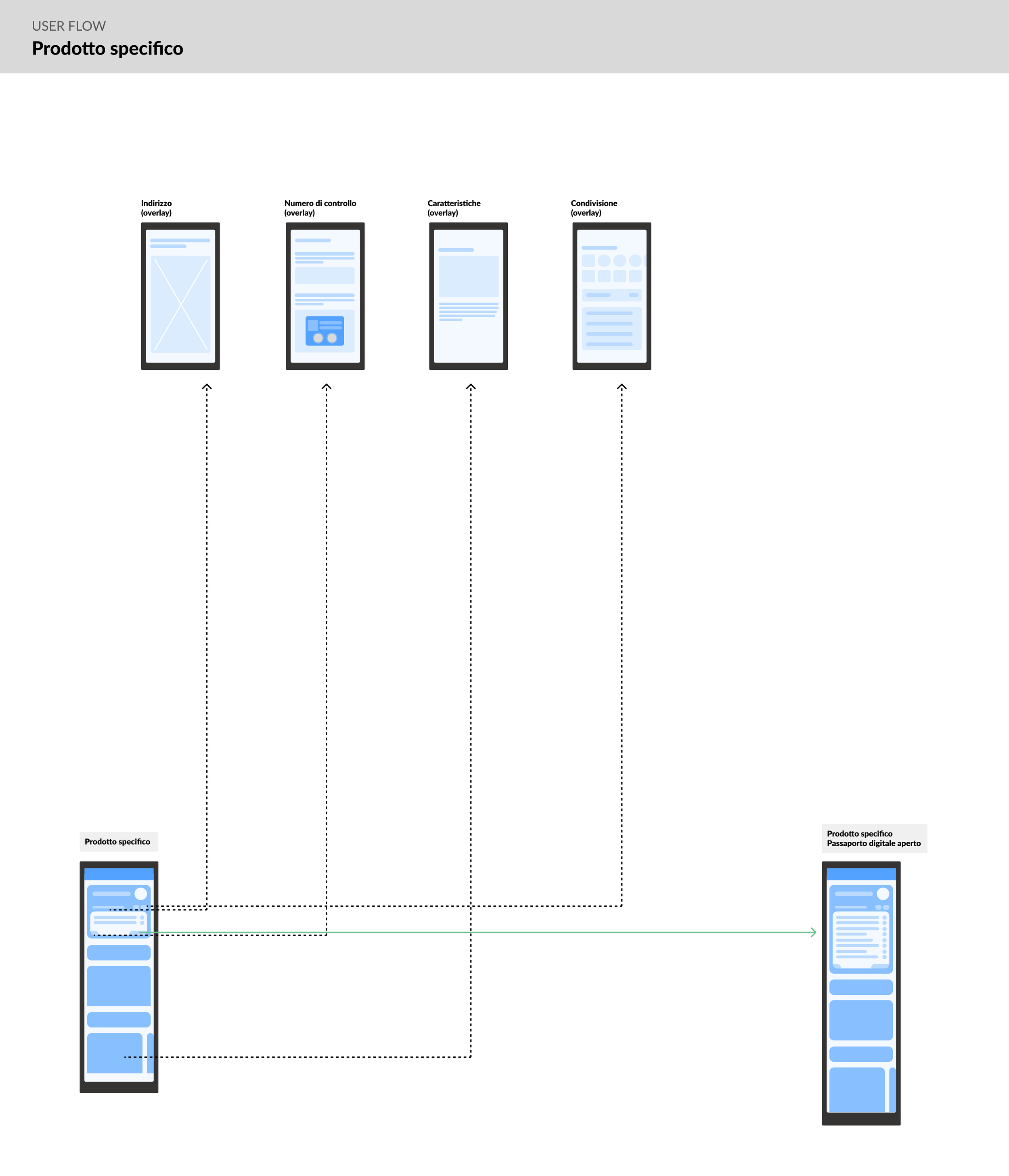
Working on userflows
For every sprint, I was responsible of working on high level user flows. This helped developpers understand how the navigation works and where every element leads.

Designing wireframes
In each sprint, I designed wireframes for every feature or flow, collaborating closely with the UI/Visual designer to bring them to life. We made sure to consider all the elements that could be reused from the Web, to create consistency between both touchpoints.

Example of a section of wireframes done for the App solution
Deliverable

Selection of key screens - from the 120 screens of the App that we delivered
Team
• 1 lead
• 1 senior interaction designer
• 1 service designer
• 1 visual/ui designer
• 1 ux writer