


12 WEEK PROJECT
Client: Financial Services - Insurance
Project: Customer Experience
Designing the interface of an IoT smart home mobile experience, for a leading insurance
THE OUTCOME
After 12 weeks of work, we delivered:
— 1 Information architecture
—284 screens including more than 37 features
—1 Interactive prototype
—1 Deck with a detailed explanation of the different features of the app
MY ROLE
— Conducted a desk research to assess different apps on the market regarding interactions and visual
— I worked in defining the possible IoT home scenarios that could occur to different types of profiles - this helped to create better connection with these profiles and understand their needs to create better solutions
— I was involved in the design of wireframes and the definition of interaction behaviours
— As well, I was involved in the description of every feature and behaviour of the app - this was part of a final the deliverable to the client
Research
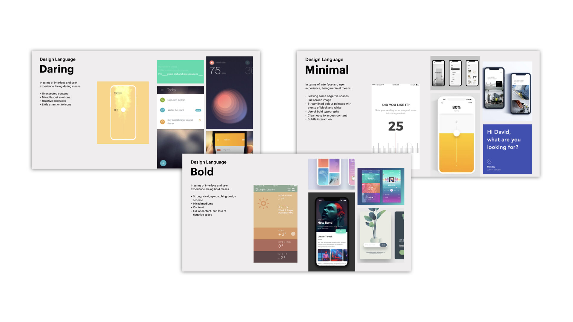
We started by conducting a desk research, assessing various apps on the market, regarding interactions and visual interfaces.
We then clustered our findings, to the 7 previously (another project) identified customer values [Protection, Trust, Reassuring, Supporting, Advisory, Personal, Inclusive] — and translated them into design drivers to guide the design process.

01. Elaboration of user profiles
We created user profiles in order to represent the different user types that will use the app. They are crucial for better understanding the users we are designing for; their needs, experiences and behaviours, as well as for helping in the recruiting for future usability activities.


02. Construction of possible scenarios
User profiles allowed us to construct a journey of the user’s possible behaviours, habits and needs. This helped in creating connections with the users, through app features, thereby increasing its presence in their daily lives.
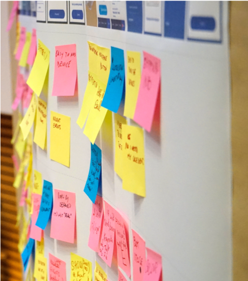
Co-creation session
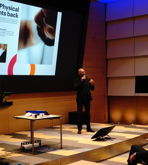
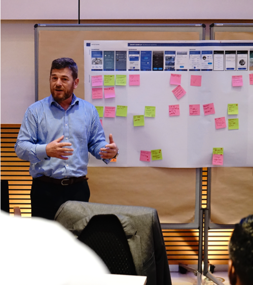
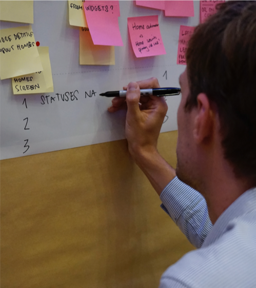
We conducted a co-creation session from which:
•The first part was dedicated to a presentation around trends 2018
•The second part followed with an exercise done by each team in order to gather insights and feedback regarding first rough wireframes of the app. Each team was in charge of one section of the app. Everyone shared out their findings and a deck was created merging all the insights found.
My role - During this session, I was facilitating a team of 7 people, explaining the main features, challenging their views and grabbing all the useful insights.
Design
01. Mapping the information architecture
We mapped the information architecture, thinking about the correlations between all the different screens.
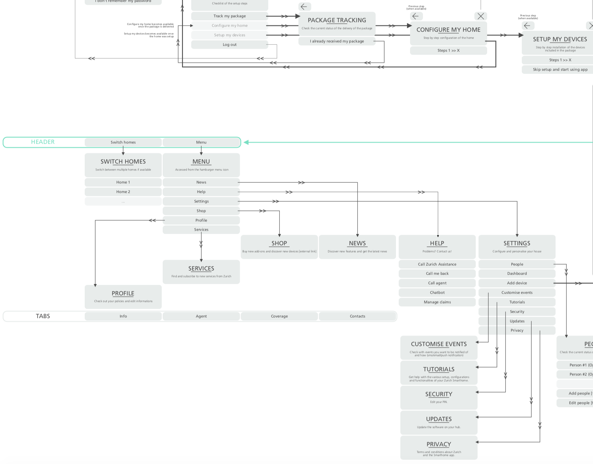
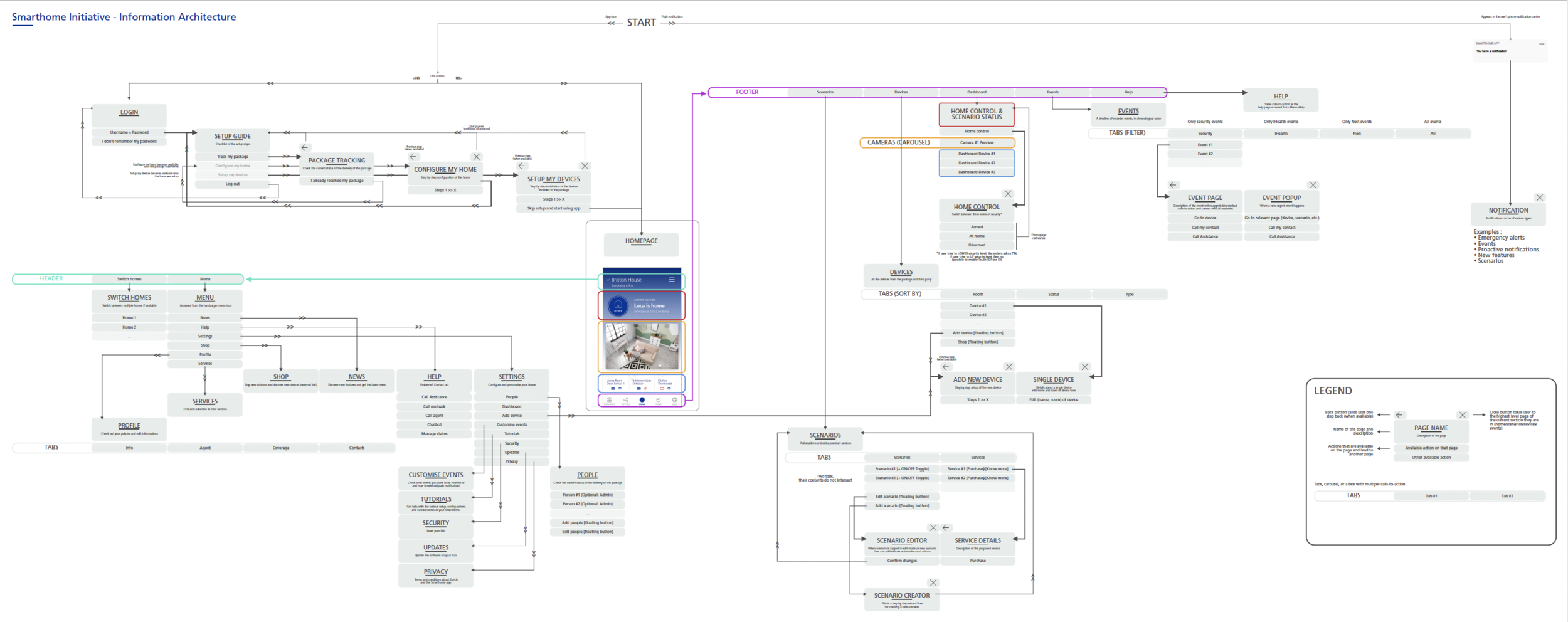
During the 3 weeks design sprints, we defined and prioritised use cases every week together with the client, in order to make sure we were going on the right track.
02. Created wireframes
For each week, we chose the use cases to focus on and designed the respective wireframes, defining all interaction behaviours.
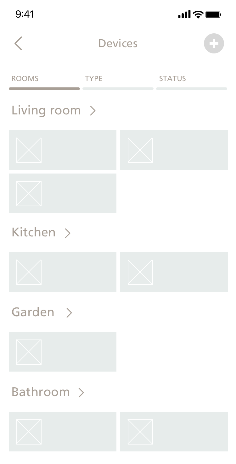
03. Designed UX and UI Flows
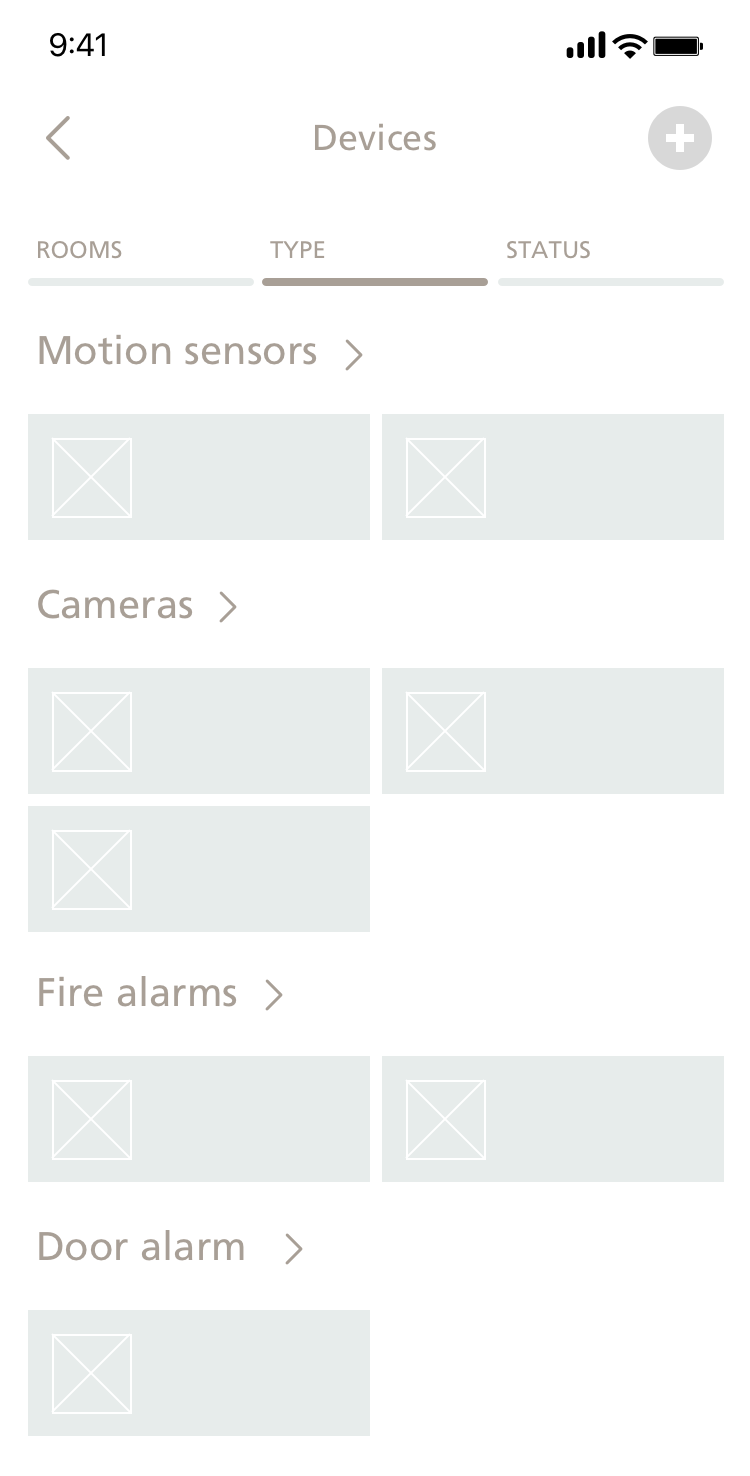
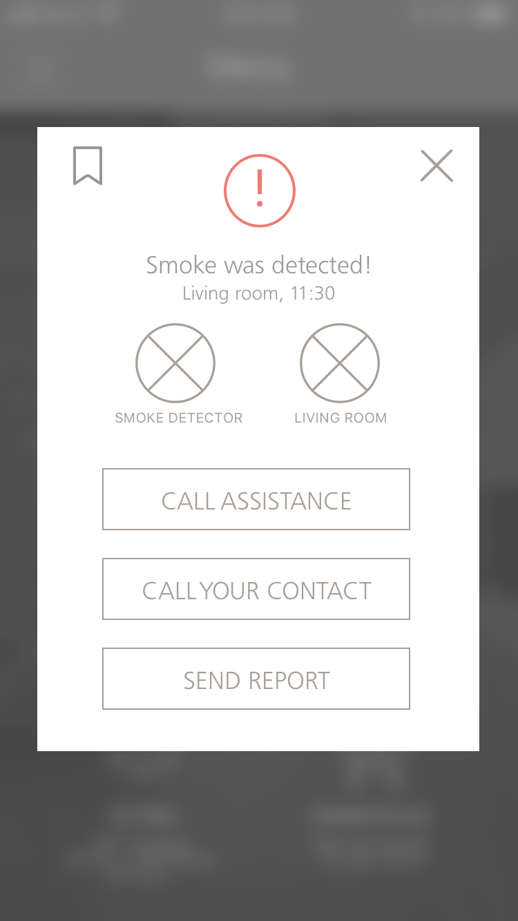
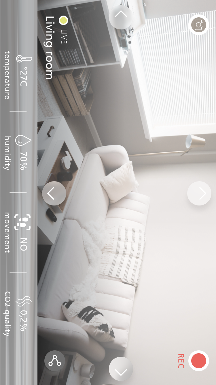
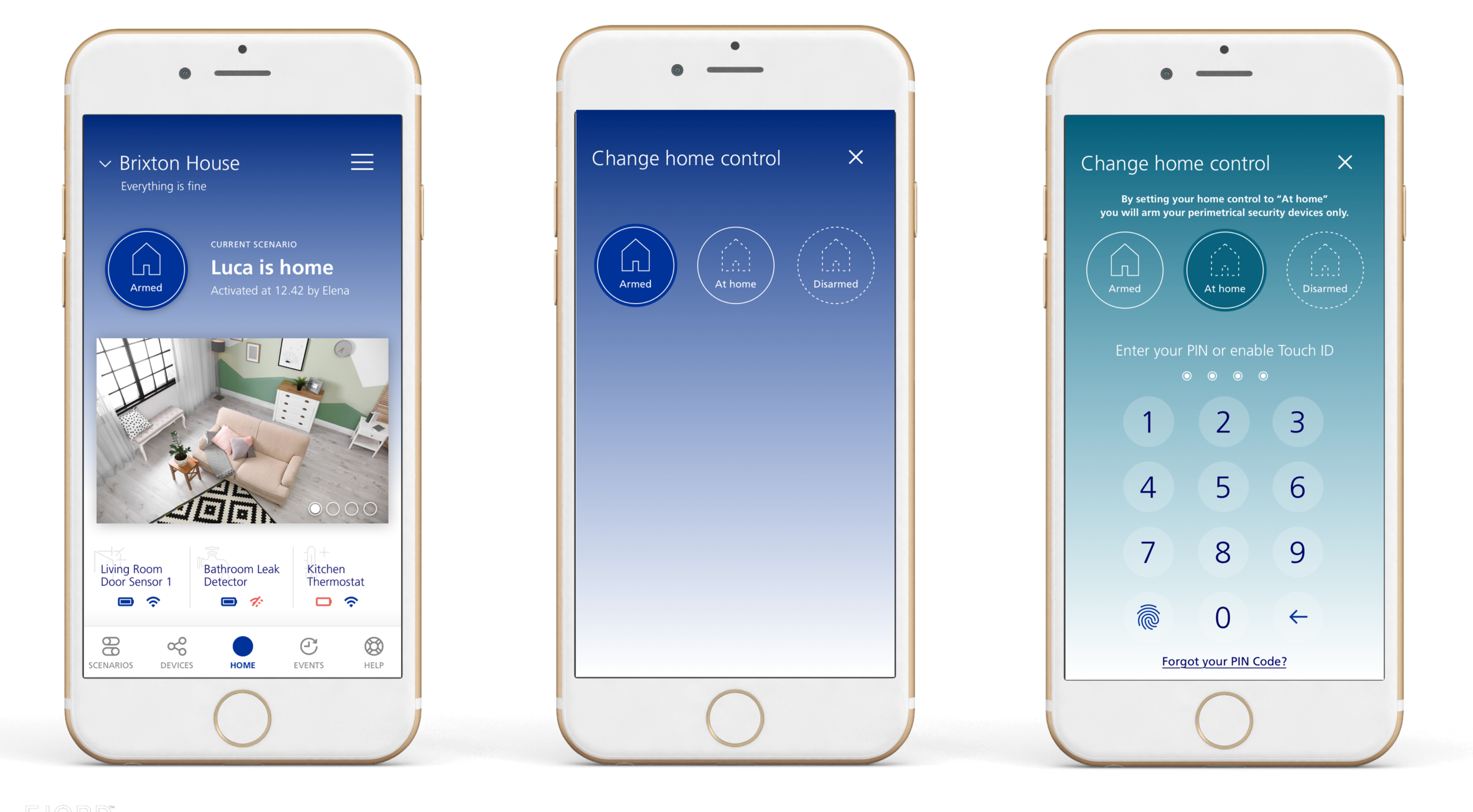
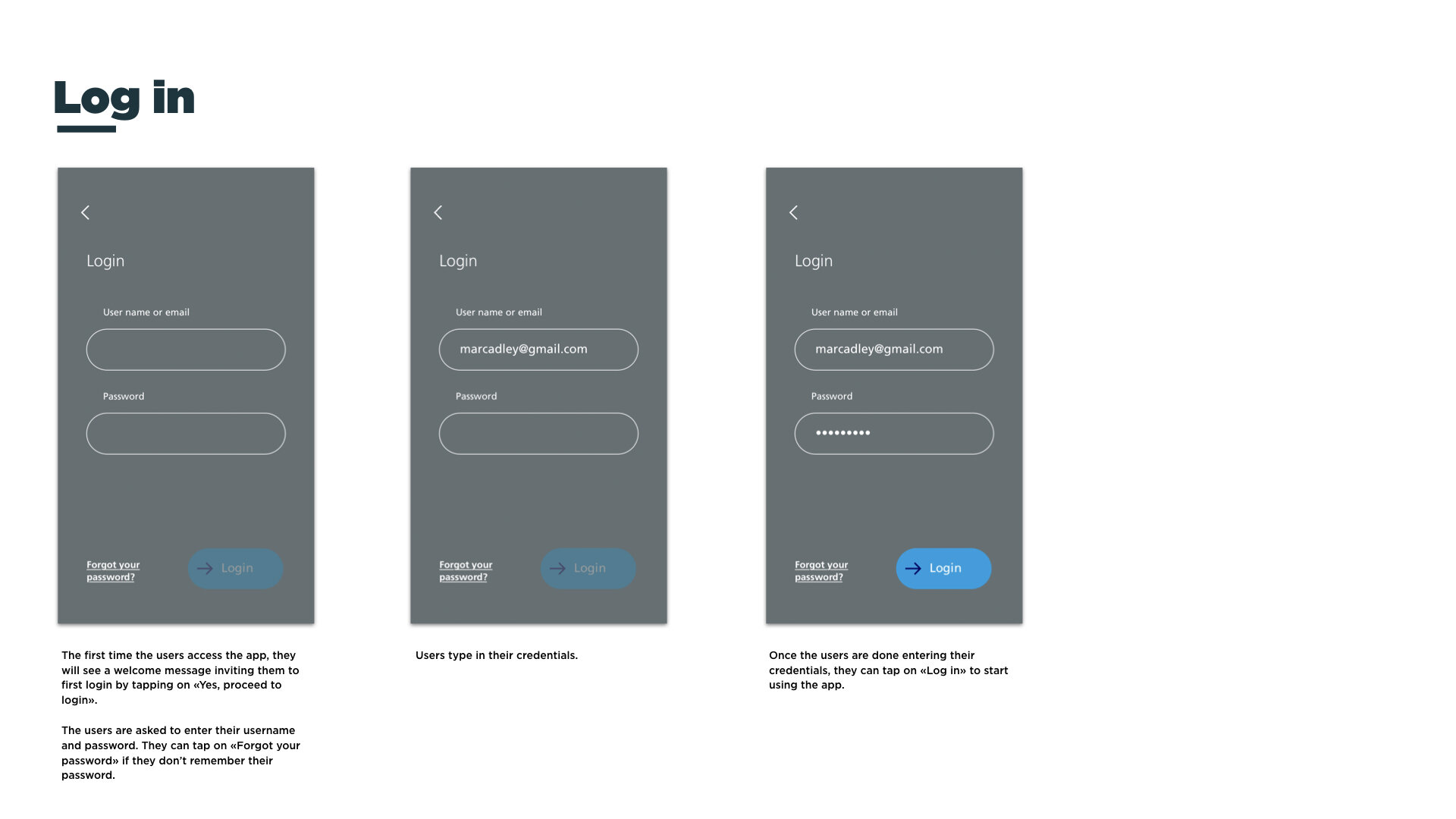
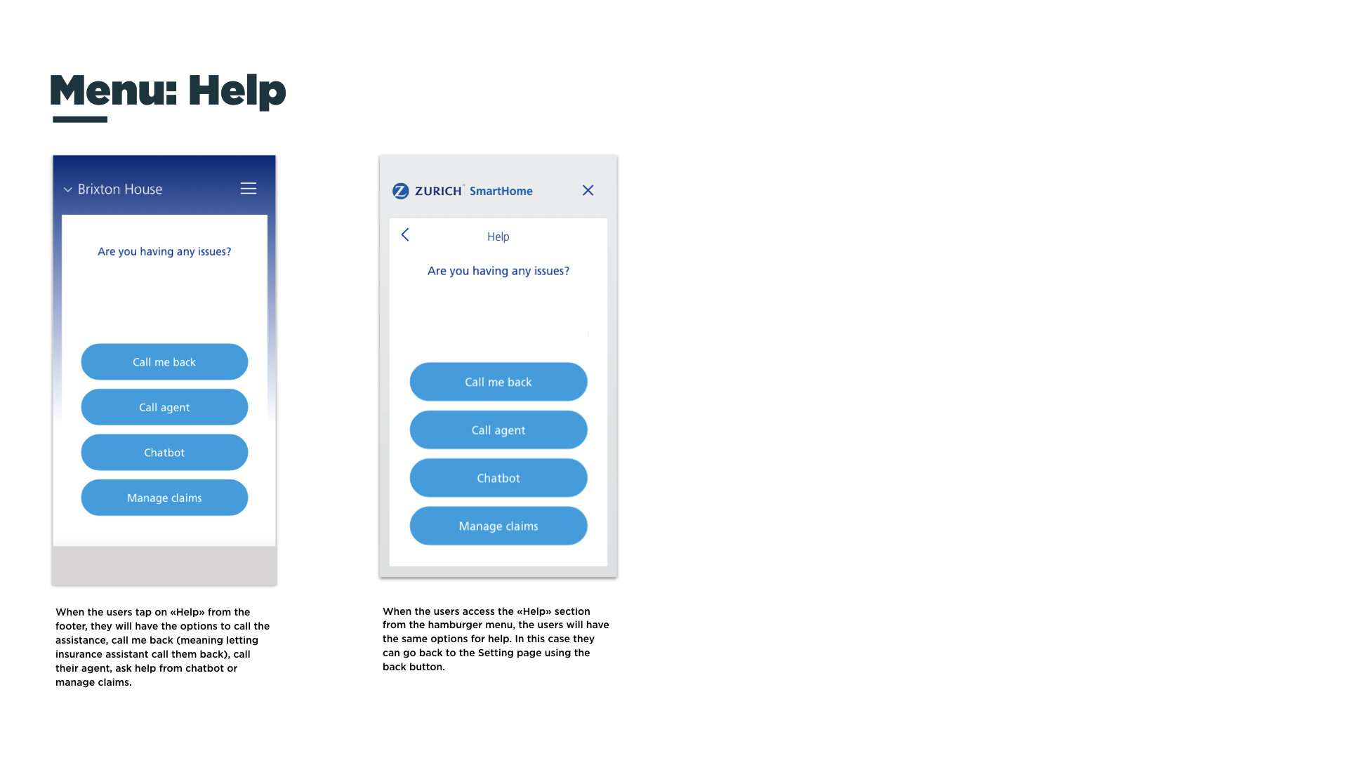
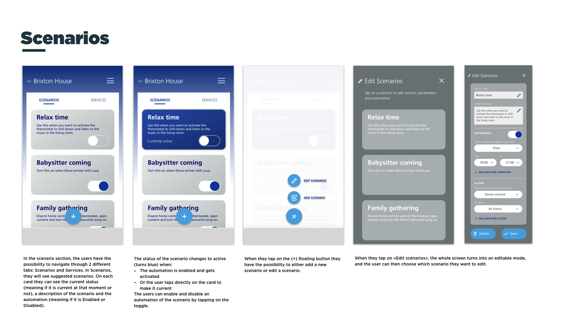
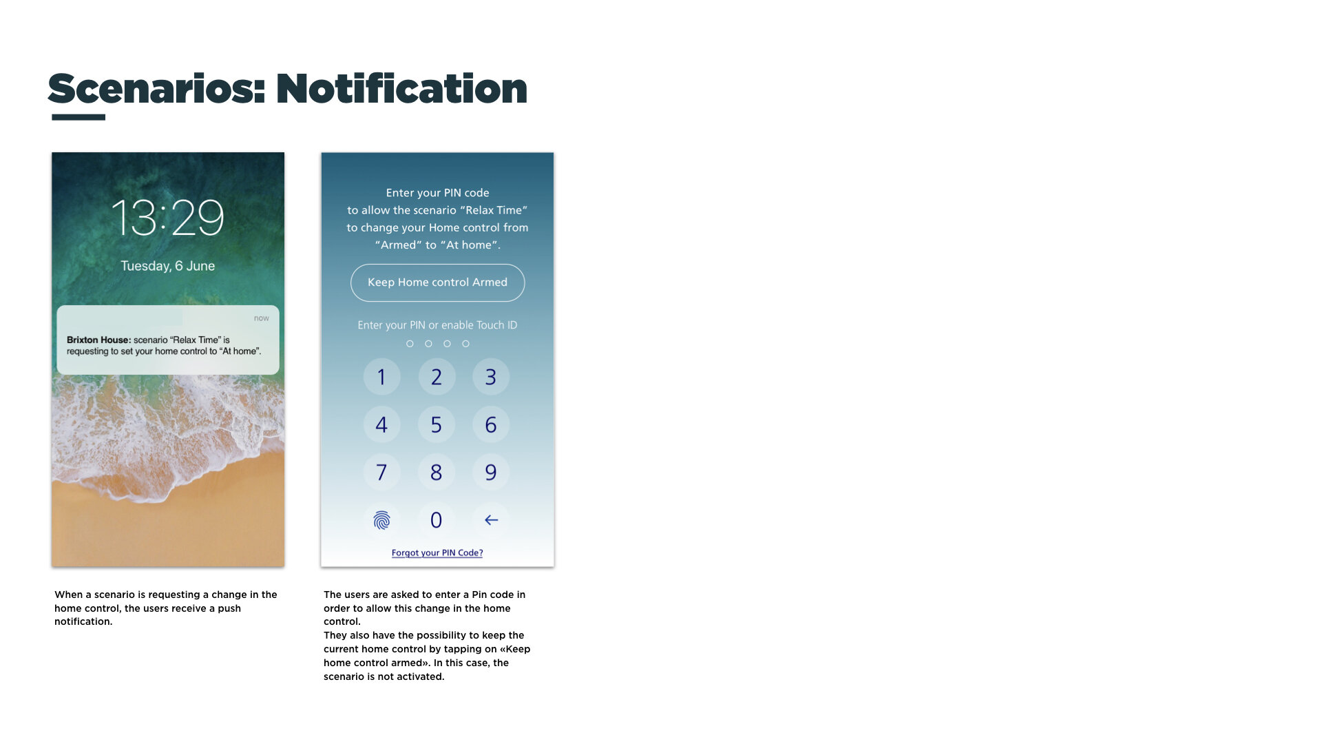
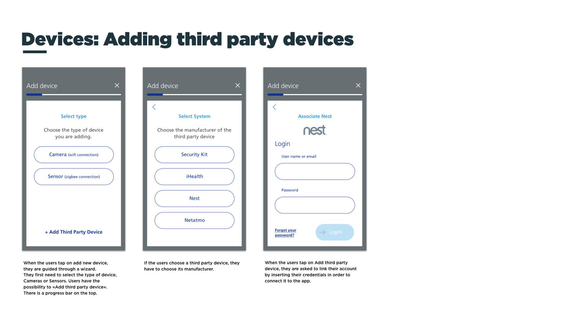
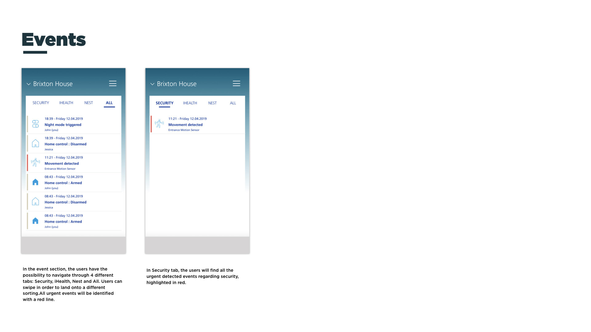
As a final deliverable we designed key screens for the app, such as; Log in, Unboxing, Homepage, Menu, Scenarios, Devices and Events.
Creation of a report that explained the content of the screens that were designed that serve for further detail design.
Team • 1 project lead • 1 senior visual designer • 2 service and interaction designers