


10 WEEK PROJECT / FULL REMOTE
Client: Financial Services (Banking, MT)
Project: Digital product creation
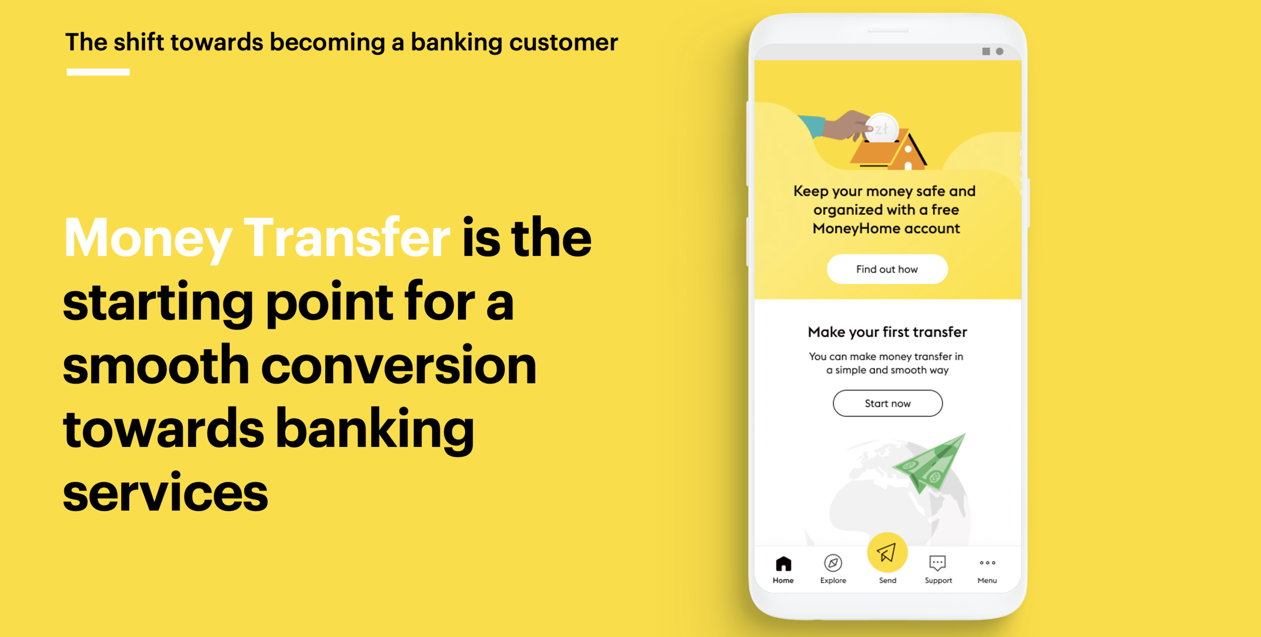
The overall challenge was to move core customers gradually away from cash, and educating them to digital money.
We were asked to design the new digital experience of this money transfer company, helping their shift to their new positioning as a bank.
OUTCOMES OF WAVE 2 - STREAM 1
— MLP Concept with 100 screens for 20 features
— A report highlighting some UX recommendations for future implementation of detail design.
MY ROLE
During this stream, I was practically involved in the whole process:
— I was in charge of understanding the current as-is experience, meaning the current app that was on the market
— Worked on looking for best practices and benchmark examples that could support the design of certain features
— During design sprints, I was responsible for designing wireframes, flows, defining ux behaviours for the new money transfer experience, and creating quick prototypes to share with the client
— At the end of the project I was responsible for compiling a report as part of a deliverable, that would showcase all the work done and highlight some UX recommendations
Wave 1
High level Concept
Before driving the project into 3 different streams, a team has had a three week phase in which they layed groundwork:
Created an ambition statement for the company
Designed the MoneyHome high level concept
Proposed a hypothesis of the business journey in the phases after the (MLP).

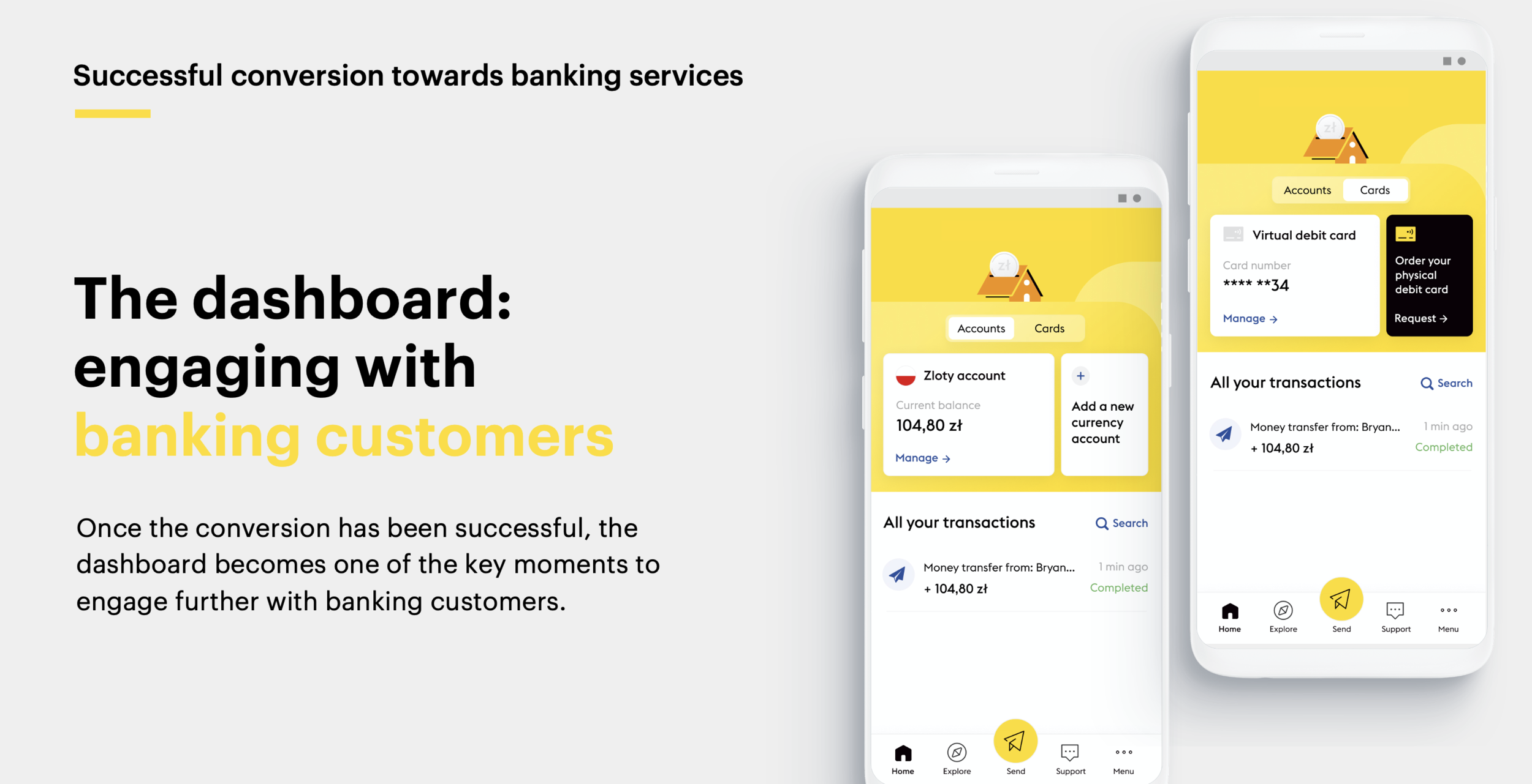
MoneyHome Concept:
Building an emotional connection with customers
The MoneyHome high level concept was a success, as it highlighted familiar metaphors, such as Homes and Drawers, to convey trust and security towards digital banking services.
“MoneyHome” represented a digital place where people feel safe and secure to store their money.
It's aim was to help them take care of their money and their loved ones.
Key advantages
Guiding customers to practice familiarity with digital (for strongly cash oriented)
Always feel in control with all their money in one place (for the ones that have life in two countries)
Easy to use features (for those feeling left behind by technology)
Safe and organised place for their saving (for those in need for tidy budgeting)
Guidance towards financial literacy
Designed user flows
During the first phase, we focused on the key user flows to build a compelling story of the “Money Home”:
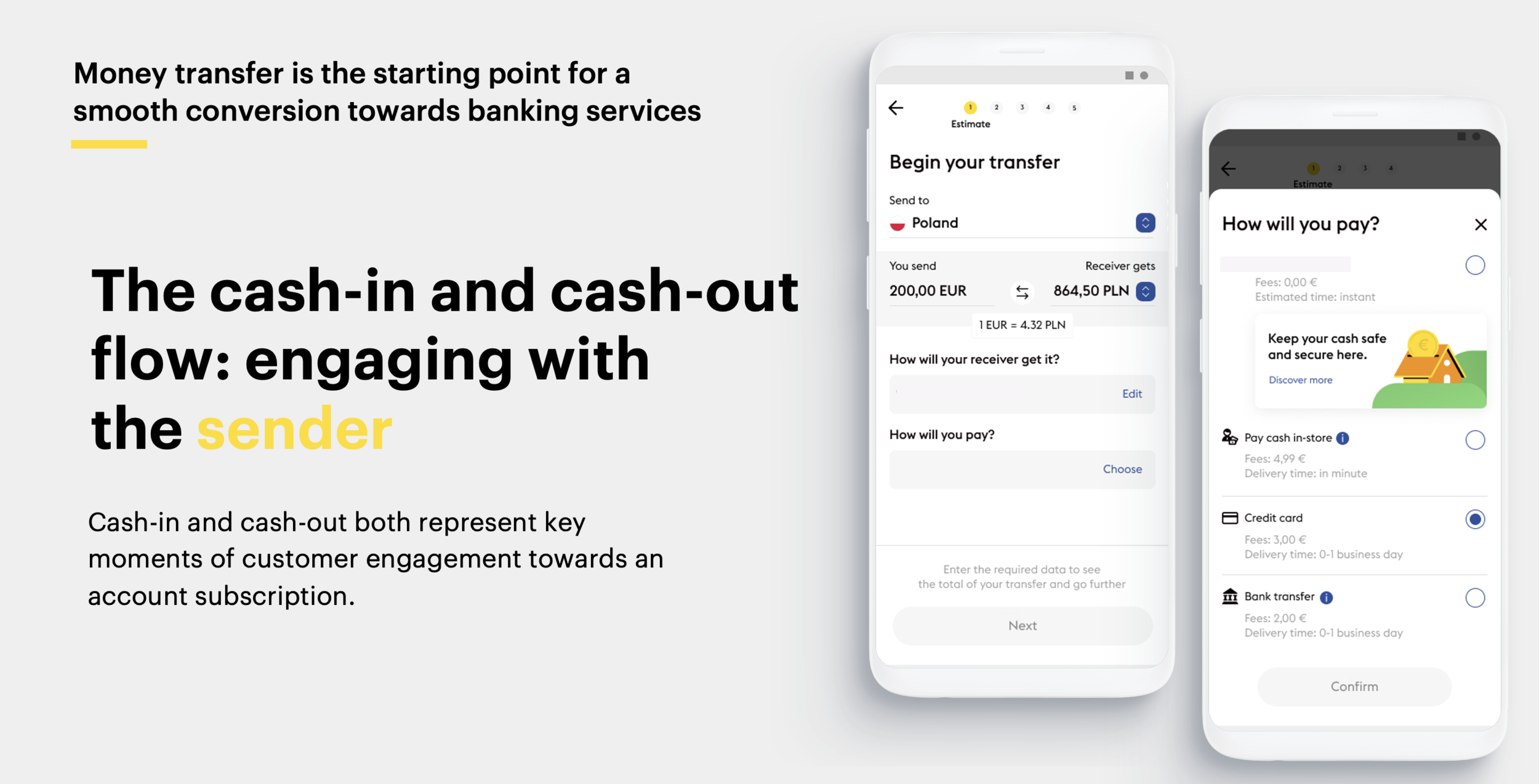
Money transfer
Drawers creation
Transactions


Wave 2
Stream 1 / MLP Product
The design challenge
How can we convert Money transfer customers, (double belongers and non-digital savvy) in love with cash, towards a new set of digital services including Banking and Money transfer?
6 weeks - 4 sprints
The new mobile app has been designed across different sprints.
During these sprints, we have designed the MLP, that will be further developed during the detail design.
The functionalities of the app were first prioritized together with the client during sprint 0.
The sprints were organised starting with a sign in, followed by collaborative/alignment meetings, and a sign-off at the end of the week.

Understanding the as-is of the current app, and getting inspired by the existing MT services in the market
As a first step, we understood the current as-is app in order to find the areas of improvements.
In parallel, we looked at some best practices of money transfer flows and banking apps on the market, for initial inspirations.

Mapping the Information Architecture

After looking at the current app and on the navigations, hierarchy of information, findability criterias, we were able to map the new information archiecture of the new app we were designing.
Note: This IA was continuously evolved during the whole project until the consolidation of the MLP product.
3 Design Sprints:
For every sprint, we focused on prioritized features and designed the representative wireframes
During every sprint, we focused on a set of features and flows that we designed and iterated, following the feedback given by the client during our collaborative checkpoints every week.
My role: I was in charge of designing wireframes, working on all the UX behaviours, making this new digital experience the most simple possible. I was working closely with the visual designer, sharing/communicating in order to come up with a complete and well thought MLP (from different views).

and worked in parallel on copy…
My role: I had an important role in the micro-copy work, as I was the one supervising another content designer (from the US) that came in to give support on that. We defined the micro-copy approach, and made sure we conveyed the principles across the whole experience.

We designed flows and created their representative prototypes


During every sign-off, we presented the complete flows on Figma but also through quick prototypes.
When the product owner couldn’t follow and didn’t have the basic knowledge of design deliverables/processes, we created flows without screens, which was useful for them to understand the main steps of the experience.
A new money transfer experience came to life, with the help of prototyping.
Prototyping played an important role in the process as it made tangible the whole MLP.

We conducted remote user tests with “Double belongers”
We conducted user tests with 15 participants (senders and receivers) from 4 different countries (Italy, Germany, Poland and Romania). In order to do that, we had to translate all the screens in these different languages.
After seeing a strong interest from the participants in the economic benefits of the product, we deep-dived into the value proposition and collected several insights.
User tests helped us understand the points of focus of our MLP, and iterate in the right direction.

We shared with the client all the designed screens compiled in a report with ux recommendations

My role: I was in charge of compiling this report, that highlights all the screens and flows designed for every sprint with annotations of UX behaviours of the app. It served as a go-to report for future implementations and detail design.
Team for this specific stream
• 1 lead
• 1 senior service and interaction designer
• 2 service and interaction designer
• 1 visual designer