
BRANDING
FREELANCE PROJECT
Dietician
The brief
The client was opening her health clinic and requested a business card with eventually a logo for her clinic, combined the values of sports, nutrition and healthiness.
First, the work was mainly focused on creating the right logo that responded to the values of the brand.
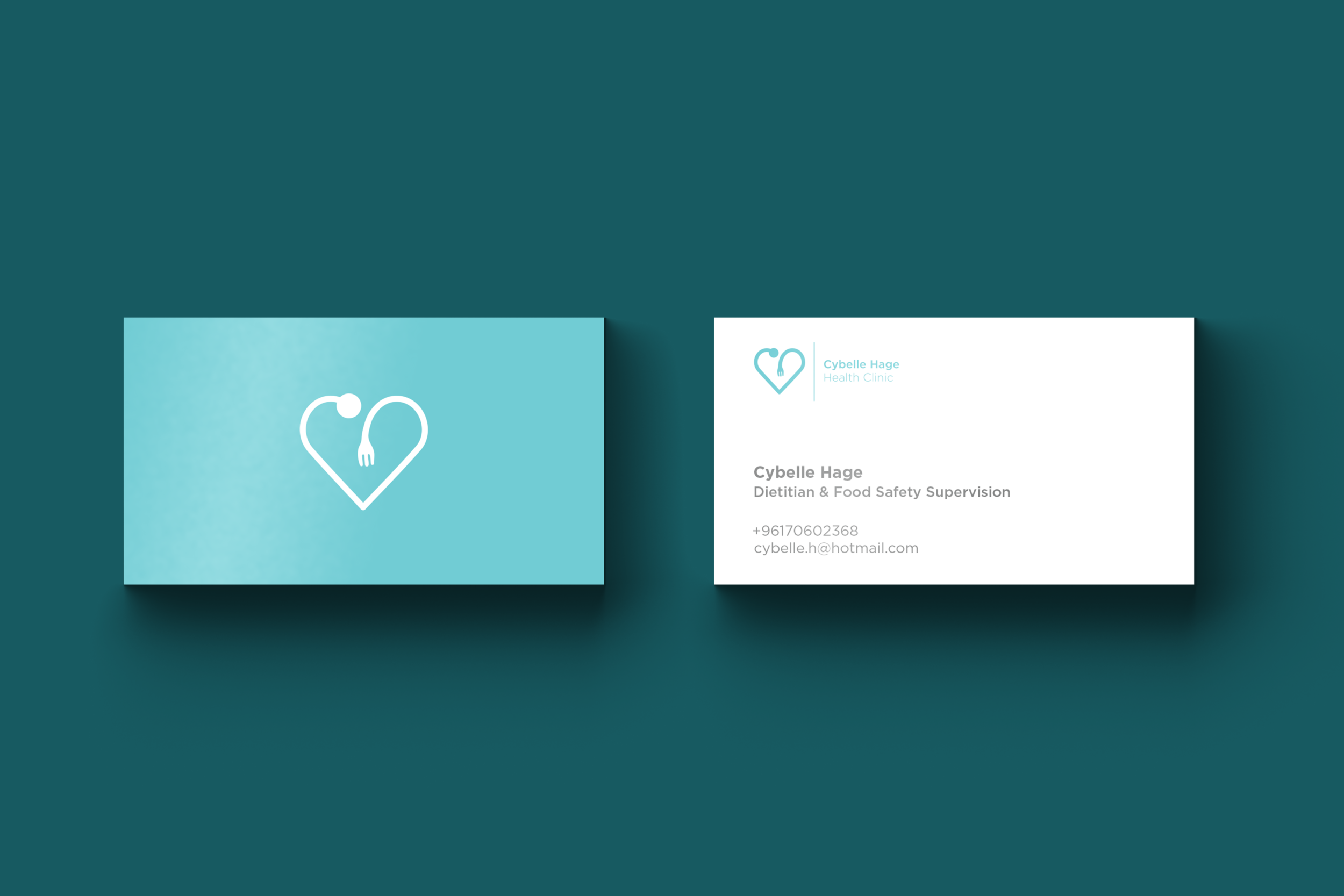
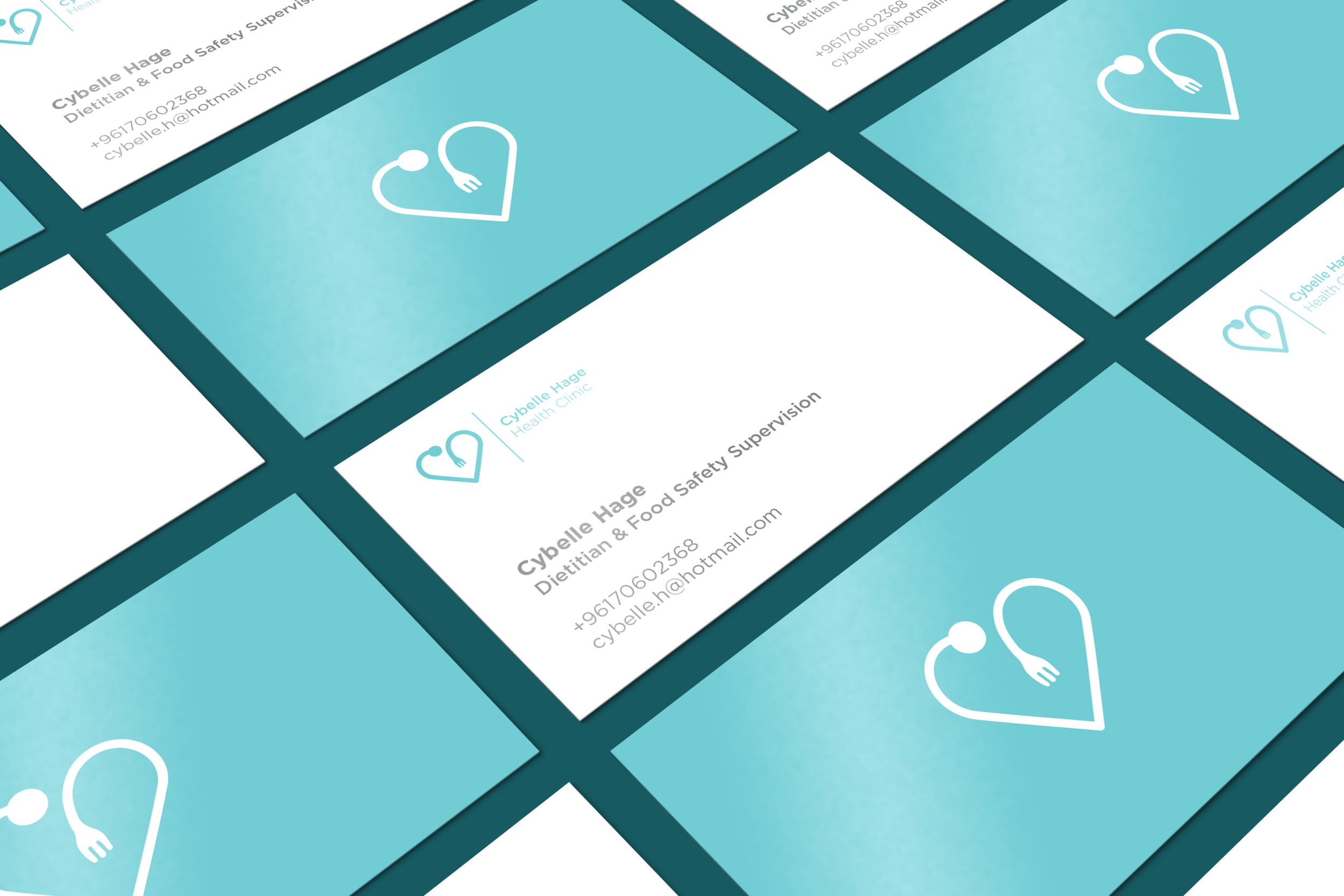
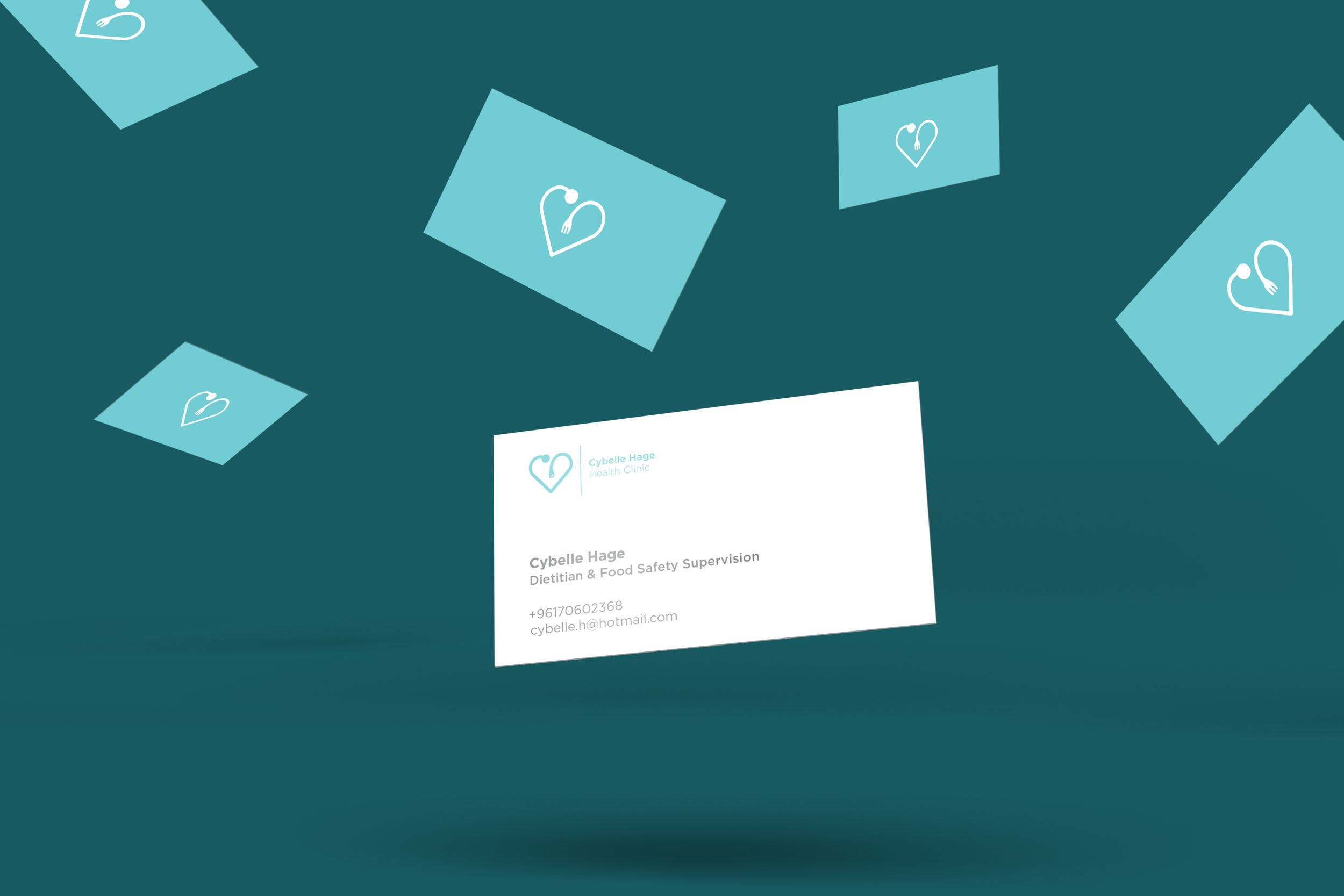
The logo
This logo combines 2 elements the health with the stetoscope of a doctor and nutrition with the fork shape. Both together form a heart. This is to say that you get to a good health with a good type of nutrition, both of them curing the heart and the wellbeing of a person.
The aim was to give both classic and modern look and feel to the brand, while having also a friendly tone, especially for a health clinic for which it's main purpose is to talk to people, understand and solve their problems. - “Friendly without being folksy”.
The business card design